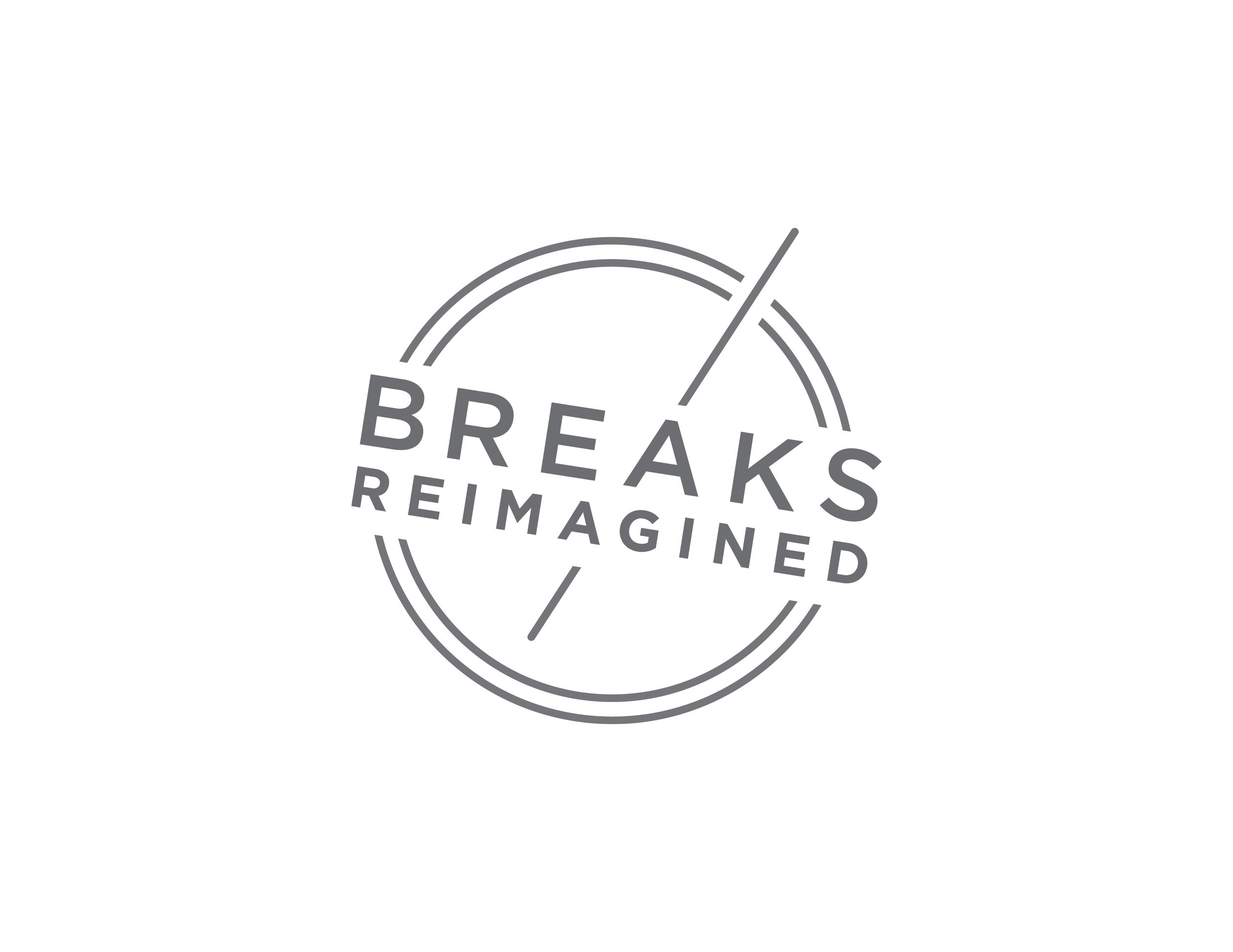
The Breaks Reimagined mark was created for Aramark’s Refreshment Services guideline deck. This mark is a light symbol of workplace breaks, both through type and the usage of line elements. The use of light gray, and therefore lack of other colors, allows the seal to be used successfully in all areas. Whether it is used as an emblem or a transparent background design element, this seal is distinguishable in the workplace.

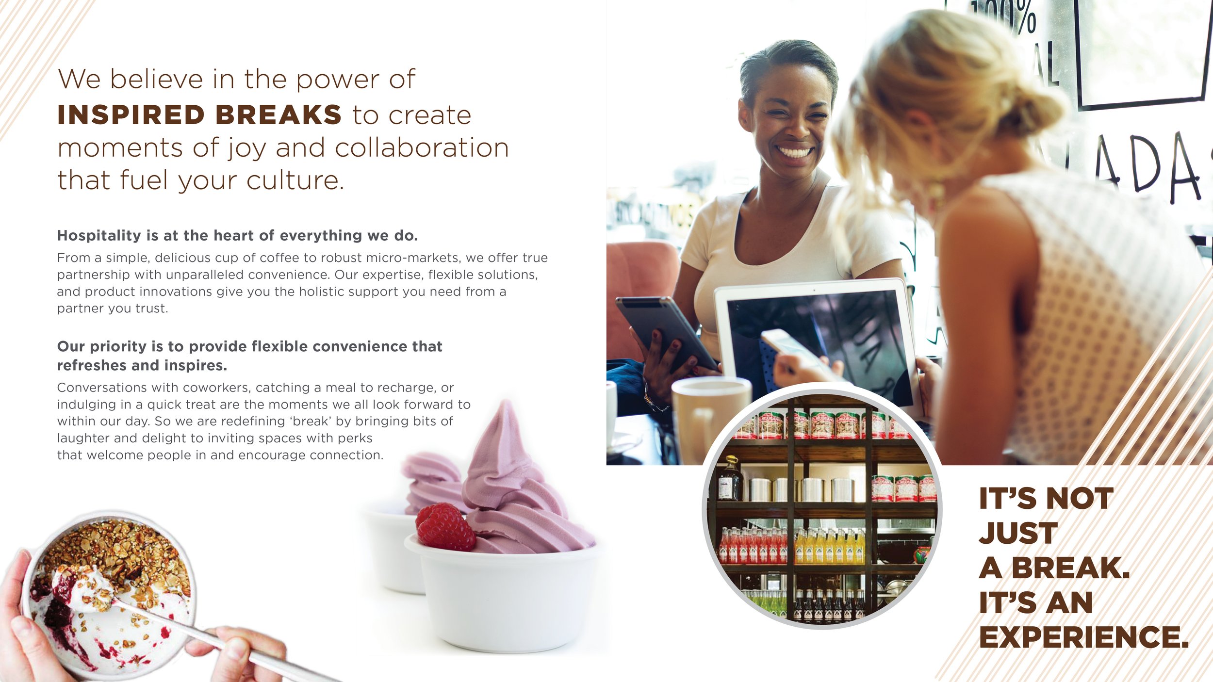
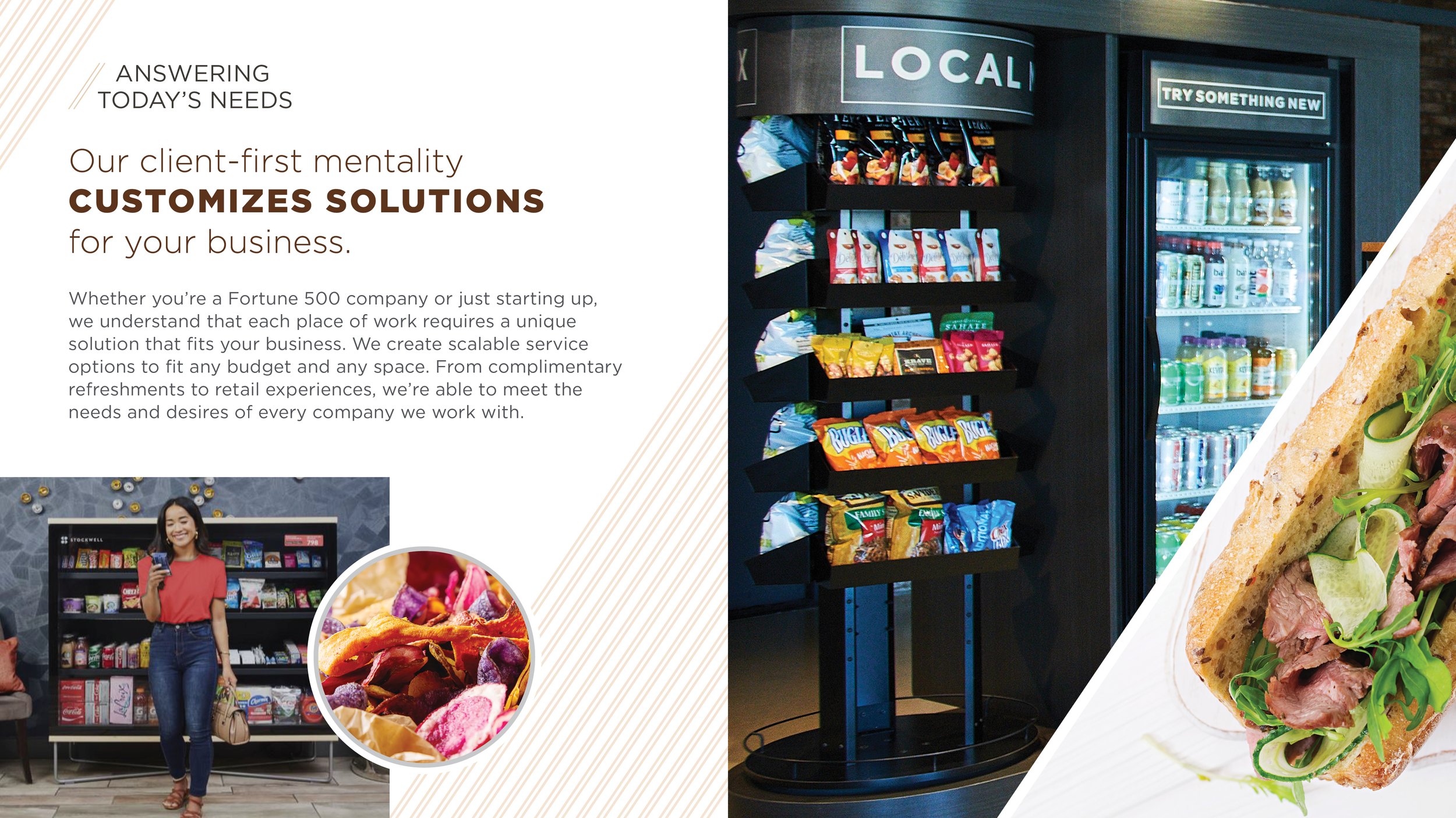
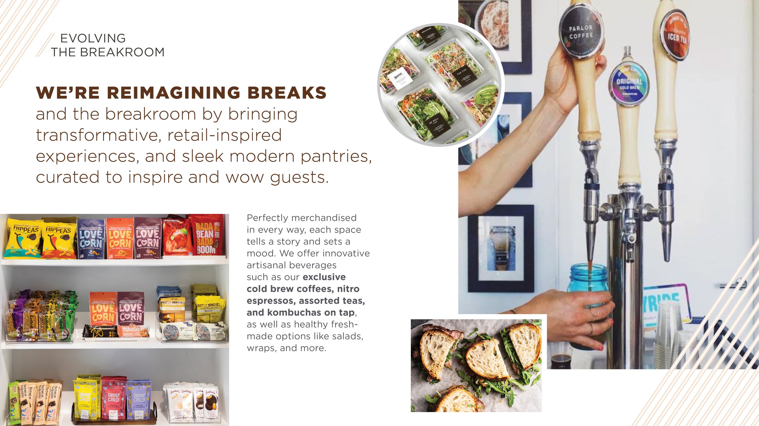
While interning at WD Partners I was assigned to the Aramark Refreshment Services team where we created the brand guidelines displayed to the left. The Breaks Reimagined seal was designed solely by myself, and I partnered with my supervisor to create the full deck. We used bright, friendly photos and pops of color to express the enjoyment employees feel when taking a break from work.

