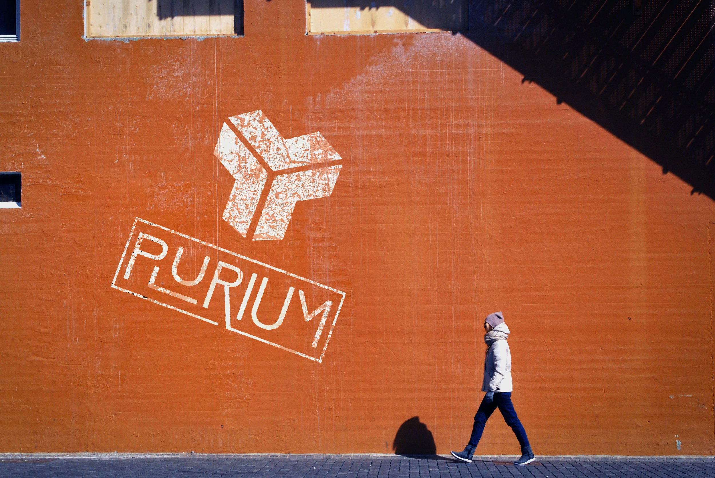
The Plurium mark was created for a conceptual EDM music festival company. The bright pink and green colors mimic lasers as a part of the colorful night life experienced at these events. The simple type can be recognized easily at different venues.


The idea for this music production company came from my love for EDM and rave culture. Goldrush 2017 was my first ever music festival. The neon lights, rainbow lasers, and loud rhythmic beats were more than enough to get me hooked. But the wholesome and genuine culture of festivals is what has kept me around.
The community encourages P.L.U.R. (Peace. Love. Unity. Respect) and welcomes all who are interested. This inspired the name of the company, Plurium.
The bright colors used in the branding are a tribute to the blinding lights beamed at festivals. The three piece symbol in the mark is used in several ways across the brand, to signify the unity of people attending these productions.
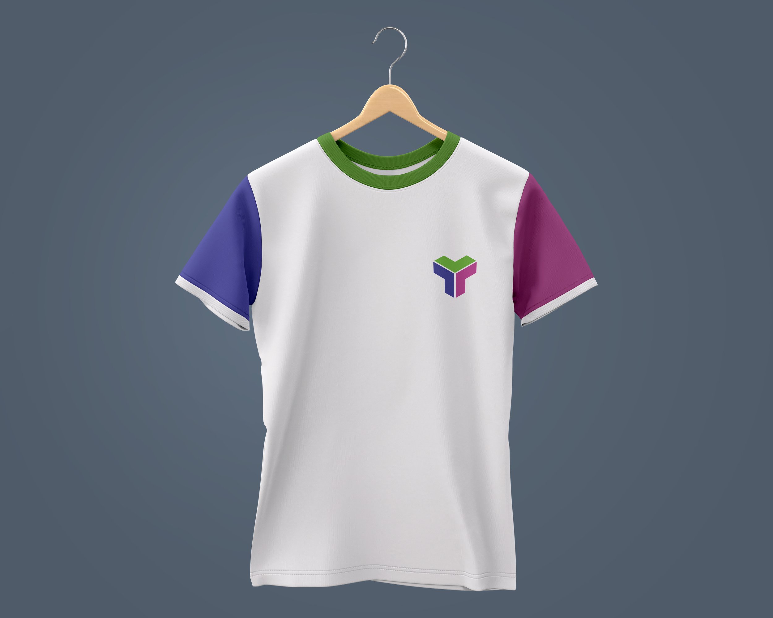
This project resulted in a complete logo, stationary set (business card, letterhead, and envelope), hoodie, t-shirt, water bottle, and mobile app prototype.
I wanted to create a passion project that I was able to fully develop and make my own, and I feel I have done exactly that.

